Product design for a fintech startup
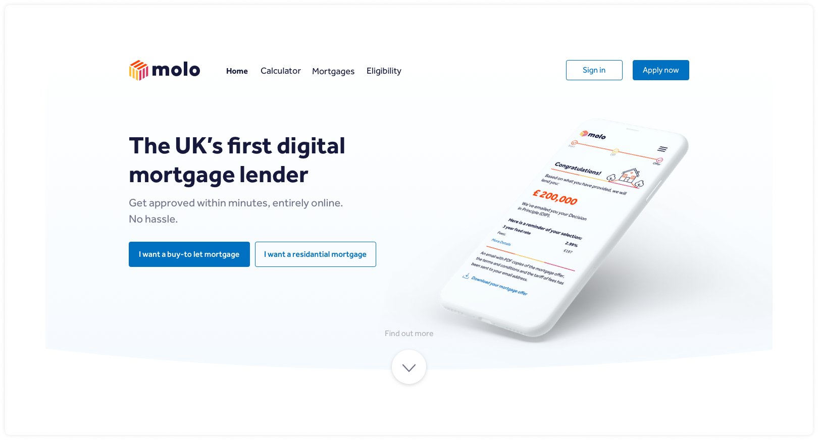
Molo are a mortgage startup who’s mission is to make it simpler and quicker for people to get mortgages. I led research and design to improve journeys for buy-to-let customers.
Design lead • Product design • UX/UI • User research • User testing
The brief
Improve the percentage of buy-to-let applicants reaching a decision-in-principle, which should then lead to an increase in conversion rates.
Approach
We had some data-driven insight to start with, showing us that users were getting stuck along journeys, preventing them from getting a decision in principle. We needed to understand more clearly what was causing problems for users, and then use those insights to improve journey design.
-
The first step was to carry out a usability study with buy-to-let customers, to find out more about what was important them and how the current UX was performing.
-
I created testable hypotheses, using the insights I’d captured during the initial user research and usability study. I then designed improved user journeys and carried out user testing with buy-to-let customers.
-
The last step was to iterate the UX design into changes we could launch, with the view to monitoring the effectiveness on coversion rates.
Research
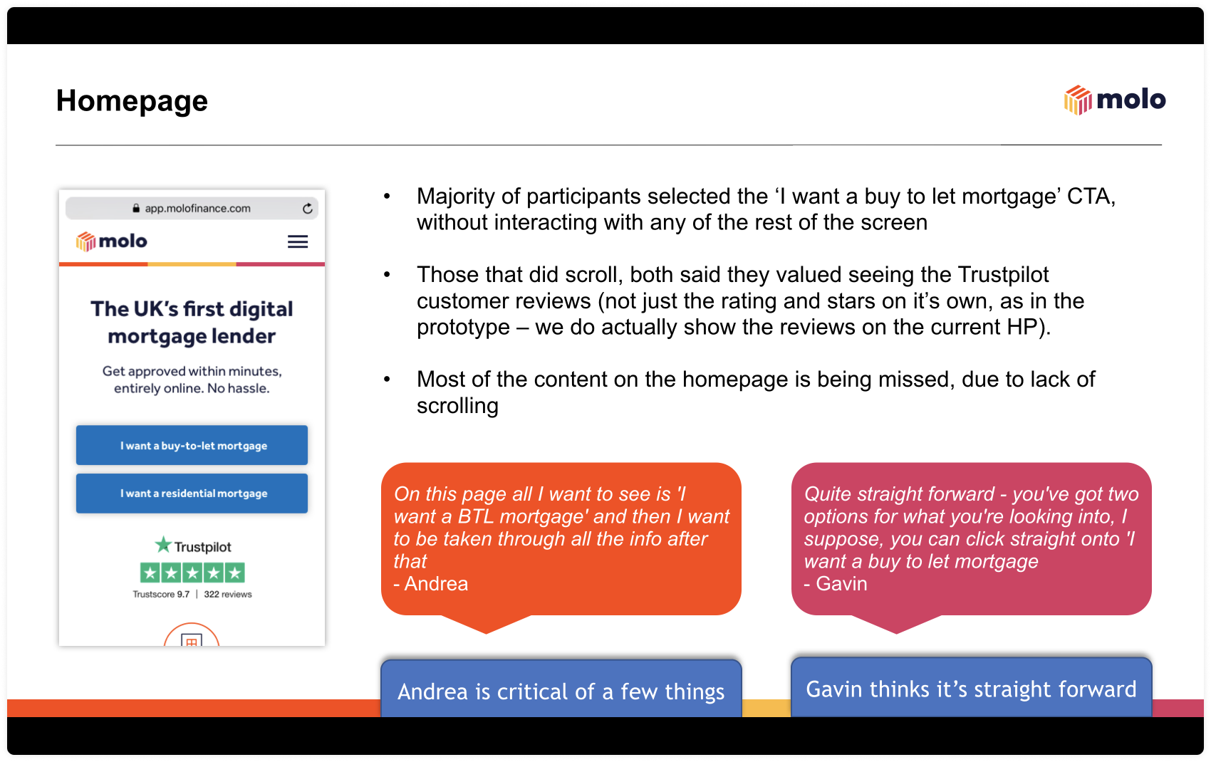
We ran remote usability sessions with 15 participants who were interested in purchasing a BTL property in the next 12 months.
Participants were asked some details about their life and their BTL investment strategy, and then asked to explore the Molo website before answering some final questions.
Key takeaways from research
Reduce jargon
Increase sign-posting of key steps
Improve navigation and pathway entry points
Homepage redesign
Look at Hotjar to see if usability issues identified match with testing and identify any other usability quick-wins we can factor in
UX design
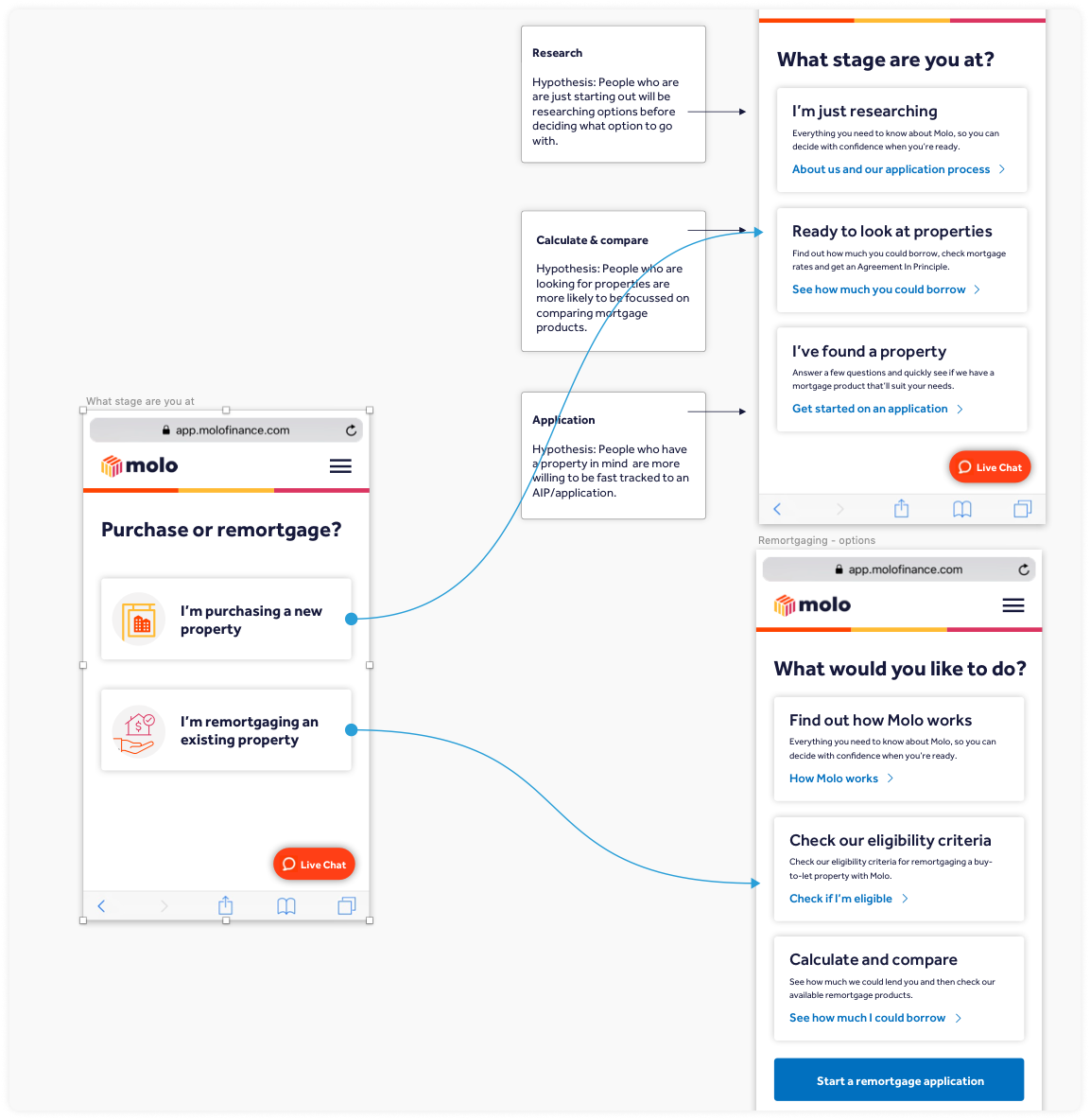
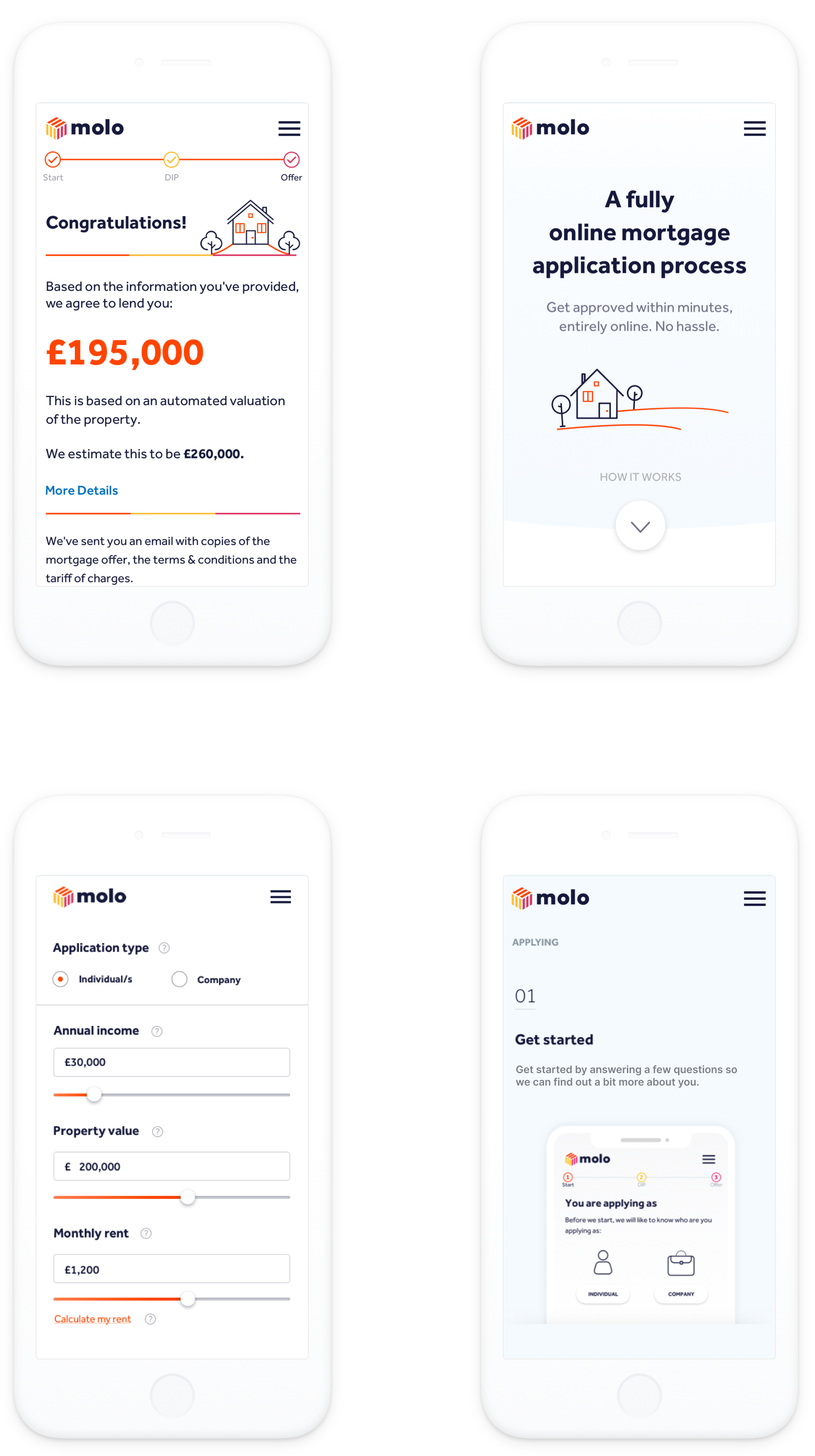
I redesigned all of the core journeys for buy to let customers, including improving the navigation, signposting and crucially, the way we uncovered intent from customers and helped route them to the correct pathway.
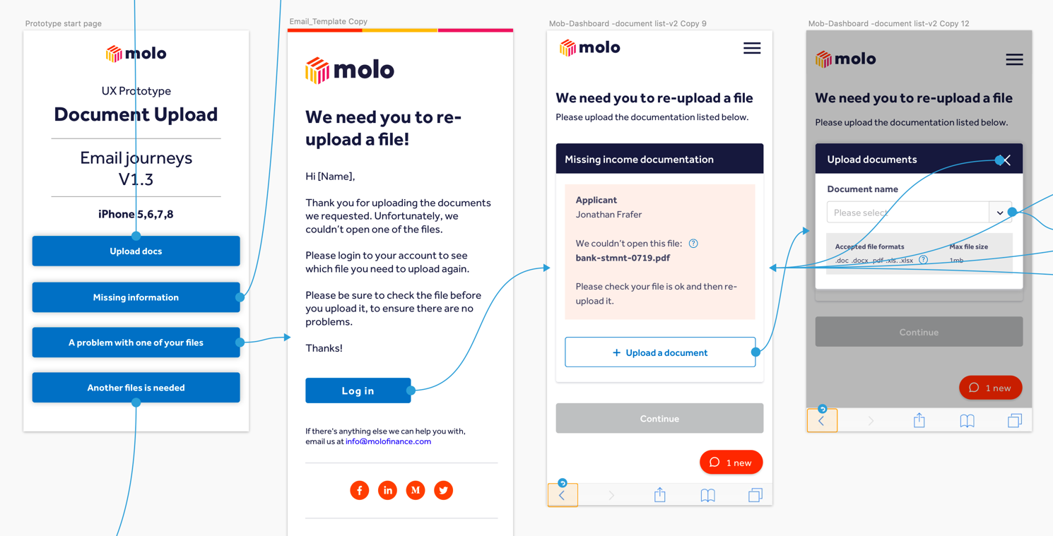
I also simplified the journey customers take to get a decision-in-principle, with a focus on reducing jargon and reducing the journey to as few steps as possible.
Solution design
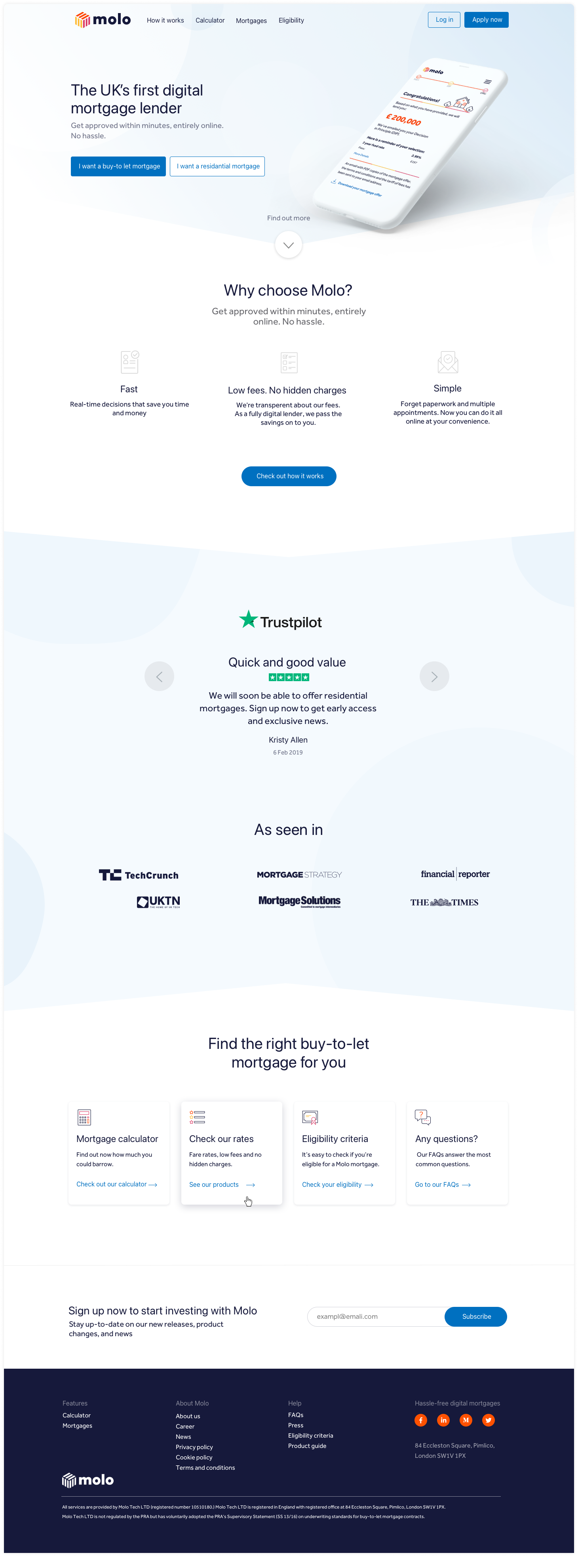
Following on from UX testing, I used clear testing results to inform improvements to the journey design. The UI redesign work was mostly focused on key landing pages, including a complete redesign of the homepage. These changes improved content design, as well as better sign-posting for BTL and residential mortgage customers, and improved journey UX.
I also improved iconography, typography and use of visual assets, to illustrate key moments in application steps.
Outcomes
We saw positive results from the changes to journey design. This demonstrated clearly that the process of research, design and user testing had delivered results for Molo.
-
Post-launch metrics showed as that fewer users were dropping out of journeys. We also saw less calls coming into our customer service team.
-
Pre-launch, we had a 12.29% completion rate, for applicants getting to a decision in principle. Post-launch saw completion rates rise to 18%.

